App Accessibility is The New Must in Mobile Development
For your mobile app to be successful, you need to make sure that it can reach the widest possible audience.
When more people have access to your app, it will boost your download rates and ultimately increase your total profits.
But in order for your app to reach everyone, it has to be accessible. So what exactly is mobile accessibility?
According to the Web Accessibility Initiative (WAI), it means that you’re making your mobile app more accessible to users with disabilities. This concept refers to more than just smartphones and tablets. Other devices need to be accessible, such as:
- smart TVs
- smart watches and other wearables
- car dashboards
- airplane seat back monitors
- household appliances
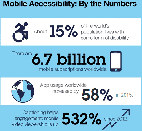
An accessible app makes a huge difference. Take a look at how something as simple as adding captions can boost engagement.
Create a Mobile App for FREE with BuildFire
Captioning increased video engagement by over 500% over the last 6 years.
Technology is amazing. One of the best things about the advances in mobile applications and smartphone technology is that enables people with disabilities to access the mobile world.
Plus, as more Americans grow older, there will be an increasing market for apps that take advantage of these types of assistive technology. Even basic smartphones come with these features.
The developers who are smart will get ahead of the game now and make their apps as accessible as possible for most people before they are forced to by the law.
Who needs an accessible mobile app?
As I previously stated, accessible mobile applications are for people who have disabilities.
Here are some more common categories of disabilities that can impact someone’s mobile app experience:
- Lack of ability to move dexterously or tap with a purpose
- Inability to process external stimuli such as sound and sights
- Cognitive impairments that prevent following too many different screens or themes
You may be asking yourself how many people this really effects.
Well, in the United States alone there are roughly 57 million people who have a disability. Let’s break this number down even further.
Nearly 20 million people have trouble lifting or gripping, which could hinder their ability to hold a cell phone. Over 8 million people have vision problems and over 7.5 million people have a hearing disability.
All of these impairments can impact their ability to use your mobile app. So, yes, enough people are affected by this where you need your app to be accessible.
Currently, there are not any laws in place stating that a website or mobile app has to be accessible.
But the Americans with Disabilities Act (ADA) says that people with disabilities cannot be discriminated against in places of public accommodation.
While a mobile app may not be considered a place of public accommodation, it’s still in your best interest to treat it as such. It will show people that your company cares and wants to help people.
What you need to meet the WCAG standards
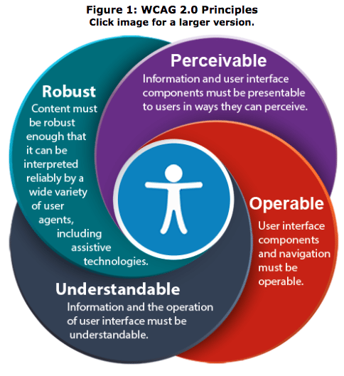
The Web Content Accessibility Guidelines (WCAG) sets the standards for making web content more accessible based on the needs of different people.
They have a detailed explanation of what should be done to accommodate those needs.
I’ve condensed their content and summarized it into a checklist. You can use this to ensure that your app meets the WCAG best practices and standards for online interactions.
Here are some of the most relevant ones for your mobile app.
No time-based video or audio that some people may have trouble keeping up with
It’s great if your app provides captions for video and audio components. If you’re already doing this, then you’ve got a head start.
But captions alone don’t necessarily comply with the WCAG standards.
It’s important that the text on the screen is synced up with the corresponding audio and video content. Make sure you’re allowing enough time for people to follow along.
If the captions move too fast, users won’t be able to read it. This is obviously ineffective.
Text to speech compatibility with video or images
People who are visually impaired may not be able to see images, videos, and GIFs. You should not alienate people who use voice technology, such as text to speech, when they’re using your app.
You want your app to be able to accommodate these users.
Information continuity between portrait and landscape viewing modes
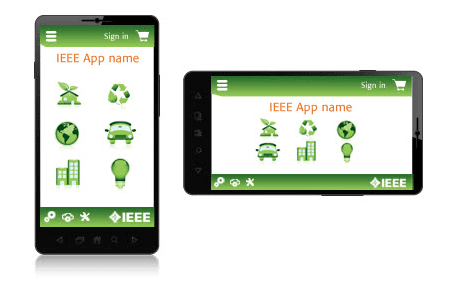
Users should be able to seamlessly view the content of your mobile app by rotating their devices between portrait and landscape.
When this happens, information should not get lost on the screen.
Here is an example to show you what I’m talking about.
Get Started With BuildFire Today!
Pick a template to start designing the app yourself, or let our professional design team build it for you.
- Mobile app development for iOS & Android
- No coding required
- 150+ pre-built features
- Unlimited customization
- 14 day free trial
As you can see, regardless of which orientation mode this device is held, the content is exactly the same.
If users have to scroll, zoom, or perform another action after they switch from portrait to landscape, then your app isn’t meeting the WCAG standards.
Making information presentable for people with colorblindness
There are roughly 300 million people who are colorblind. The majority of these people are men.
In fact, about 8% of all men are colorblind while less than 1% of women are suffering from the same disability.
Your app needs to be able to accommodate these people. To do so, you’ll need to make sure that there is a clear separation between the foreground and background on each screen.
Don’t use conflicting colors that can’t be processed by people who are colorblind.
The idea is to make each screen as readable as possible no matter who is looking at it.
No seizure inducing light flashes
People can get seizures from flashing lights. Your app shouldn’t have anything that would cause this to happen.
So avoid flashing lights and color backgrounds that are constantly alternating. If your app has these elements, you should have an option in the settings that allows the users to turn this off.
Adjustable time for people with learning disabilities or visual processing handicaps
You need to provide sufficient time for users to read and process your material. There should also be a dictation option to have content read to the user.
Don’t set up your app so that pages time out on a user who needs extra time to read. They should never lose their spot in line because of this either.
Navigation aides to find content and information
It should be obvious which buttons or links will bring users to another page or complete a certain action. You’ve got to make sure that these buttons are clearly differentiated from one another.
You can use different colors to make this happen, but you can also use characteristics that are not related to color.
For example, you can use bold words, underline, or place buttons within boxes.
Adjustable size text, color, and brightness built into the app
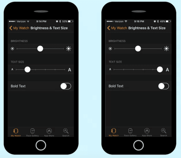
While most devices have options for people to adjust the text size, brightness, and color on a screen, your mobile app should offer the same thing within your settings.
This is a great example of how easy this can be for you to implement.
Simply include a slider bar or something similar where the user can adjust the settings to their liking. Not everyone will be able to read your content on the default text size.
You’ve also got to make sure that your content gets formatted properly once the new sizes are applied.
Future proof assistive technology compatibility
You should always look to the future when you’re creating a mobile app. Think about technologies that are new or currently in progress. Focus on assistive technologies.
Is your app compatible with these?
You need to make sure that your app can accommodate existing assistive technology as well as future assistive technology.
Conclusion
I realize that incorporating all of these accessibility features into your app can be a challenge.
But with that said, it’s really worth it in the long run. First of all, trying your best to accommodate people with disabilities is just the right thing to do.
However, by doing so, you’re also broadening your scope and opening up your app to a whole new audience.
Certain people may have initially been discouraged from downloading or using your mobile app.
Once you implement these accessibility features you’ll end up making more money from new users.
The checklist above is a great resource to help you get started on the right track to making your app as accessible as possible.
Incorporate these best practices and you can be sure that your app will be a success today as well as tomorrow.
What features have you added to make your mobile app more accessible?
